BOOKCOVERS
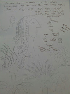
When I started this degree I felt like a 'Fish Out Of Water' and whilst I have been on the course I have had to do some serious multitasking to cope. These may be a good starting point for book cover titles.
Although I have been experimenting with ideas, nothing is really grabbing me. I haven't experienced that 'light bulb' moment yet. There is something missing and although I have tried to ignore it I keep stumbling across information and write ups on the Great Gatsby. Yes I know its a novel and I am supposed to be stearing clear of novels but my gut thinks its right so I am going to look into it!
The 1920's was such an elegant time and I would like to attempt a cover that encompasses the art deco design in some way. Below are some examples.
Bold and graphic. Think this would suit my style.
Posters by Robert Rusin
Rene Magritte
So cool!
Gilbert Paye
Erte.
Art Deco type.
Art Deco wallpaper.
Book covers.

I have been exploring the art deco flooring as design idea.

Below is the new version of the film released in may. Lots of art deco reference. Prada designed the outfits. Elegant and typical of that era. Want to convey this elegance in final image/s
These are typical art deco patterns.
Like the simlpicity of this. The art deco shape intertwined with the elegance of Gatsby's pin tucked evening suit. I have used the yellow as this is very much art deco and represents the Gatby's car which plays a big part in the the novel.
I have also spent some time exploring the art deco flooring, which was a very distinctive feature of that era.
The image above shows the tiles in my hallway. The house was built in the late 1920's and so this original
floor has definite art deco shapes.
Strong bold shapes can be seen in much of the flooring.
These colours are typical of art deco flooring and also tie in to the Gatsby novel.
eg Gatsby's car and his evening attire.
I have been experimenting with floor tile rubbings but although I like the effect, it is not strong enough to represent the art deco bold shapes. Needs to be sharper imagery.
We had a visiting lecturer in today who has inspired me to play around with the roller and paint. His name was Ian Murray and as well as being a thoroughly nice bloke I loved his work. Thanks Neil for bothering to organise his visit, it was well worth it, learned a lot.
Exploring paint effects.
Like the geometric shapes however, looks a bit like a reproduction art deco bathroom tile. Need to experiment with shapes.
Below is an idea using a very typical art deco shape.
Like the outcome of this experiment. Very art deco, sharp and bold, ties in with Gatsby's sense of style.
Have spent a day on the computer playing around with images.
I like the fan part of this image however the bottom part of the image too clumpy. Needs refining.
I have reworked this image using a slightly different paint effect, created with sponge and stipple brush. I have also changed the base into a diamond. Still art deco in shape but gives the picture a certain elegance.
Have redone this image, with overlaying card to give the pin tuck effect. It works well and the text is broadway, typical of this era. Tutor suggested I give it a drop shadow to make it stand out a little more.
The next image is based on my art deco tile idea. I think the shapes work well together without looking like a reproduced art deco bathroom tile.
My final covers.
EVALUATION.
It took me quite sometime to hit on the right subject for this project. I had tried to steer away from a novel but after much research into non-fiction I stumbled across Gatsby. It appealed straight away and I have really enjoyed emersing myself in anything 1920's, although I have made a concious effort not to illustrate the man, but the era.
Using art deco shapes I have experimented with texture to create bold graphic images for the Gatsby novel. My reseach has given me an insight to the main subject areas of the book, with Gasby's car being one of them. The yellow in my images represents the car and the black and white art deco shapes are a nod towards the elegance of the Gatsby evening dress present at many of his lavish parties.
The final outcome took some time to perfect with many prototypes being made before I settled on the final images. The tile idea was the more complicated and I had to be very careful not to produce something that looked like a reproduction bathroom tile.
I am pleased with my final images and although I spent an awful lot of time on the tile idea I feel the pin tucks and the fan are the stronger images.


.jpg)


No comments:
Post a Comment