Monday 21 January 2013

WIND IN THE WILLOWS


I HAVE LOOKED AT MANY WIND IN THE WILLOWS COVERS AND FOUND THAT THEY ARE ALL VERY TRADITIONAL IN DESIGN. IT WILL BE QUITE A CHALLENGE TO GIVE THE BOOK A MORE CONTEMPORARY EDGE.


I am thinking of illustrating the wild wood, to give the book a darker feel. After all fairy stories are quite dark traditionally. I have looked at lots of wood/forest images, here a just a few.


                     Here a few preliminary sketches, although ratty is a bit too traditional perhaps.?


Neil suggested I take a look at Mark Hearld Lino cut man. I need to think lino when drawing my images.


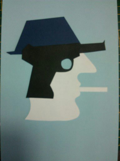
Wanted to lino cut this piece, but did not work out. I thought it was simple enough until I started cutting and realised lines were too confusing so back to the drawing board. Going to look at card cutting perhaps? Will experiment further.


Like this graphic image, the green signifies the Willow, the black shows the Wild Wood and its prying eyes and the white, the snow with ratty on his way.


I think I will use this image and complete in Photoshop. Works well as cover. Simple but bold with a limited colour palette to catch a buyers attention.


Tuesday 8 January 2013

THE BIG SLEEP

                                                                 THE BIG SLEEP
                                                      BY RAYMOND CHANDLER

                                                                 A crime novel .........


                                                                    ...and a movie.


                               I read the novel and watched the film starring Bogart and Bacall.


                                                 The film is a film noir which I really enjoyed.
                                   Love that era of snappy suits and chic, well dressed women.


Started to play around with fashion and colors. The opening paragraph describes Marlowe in his powder blue suit with dark blue shirt and tie.


  Ian Rankin describes Marlowe as a knight errant in search of adventure. I like this knight idea. Will explore.


                                                                 Below are a few ideas


Want to achieve a Kauffer type image for image below,
May try a lino cut.


                               Found another Mcknight piece and experimented using text from the book.


Mark suggested a couple of artists to look at. Images are dark and have an uneasy feel to them.
Ken Currie......


                                                                 ...and Guy Denning.


love the texture of these paintings. Will use  the techniques to experiment from this.......


                                                                    .......to this


                               like the texture of this image. A possible book cover perhaps?
The answer to that is a resounding NO! Tutor took one look and said "go back to your graphic style!
So here is the rest of my ideas. I have experimented with card and I am quite pleased with the results.

 
So back to McKnight Kauffer, who I have mentioned several times is a source of great inspiration.


Final book jackets for competition. Thet are bold and eye catching, pleased with this result.